ROOTS OIL New Packaging Identity

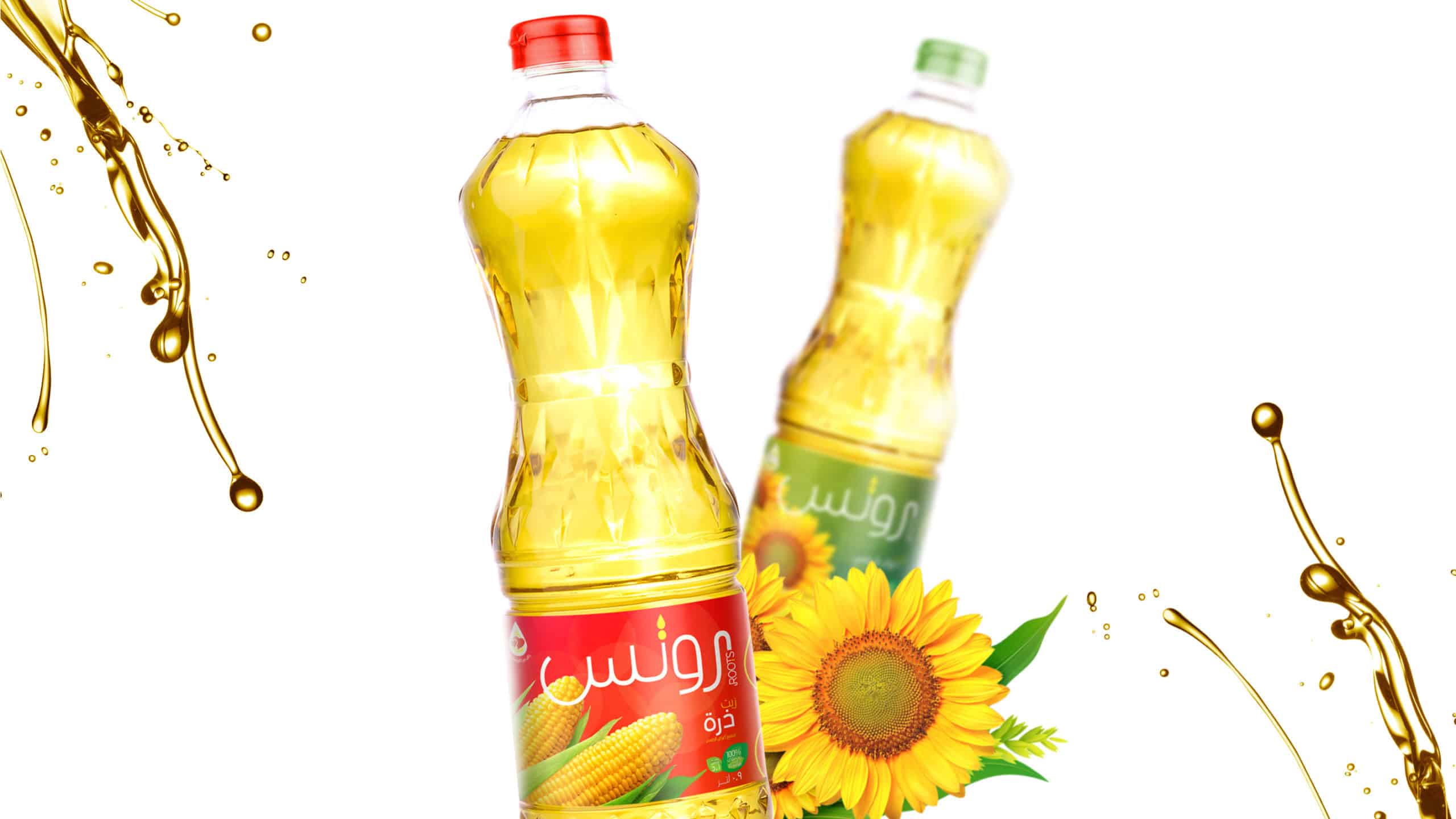
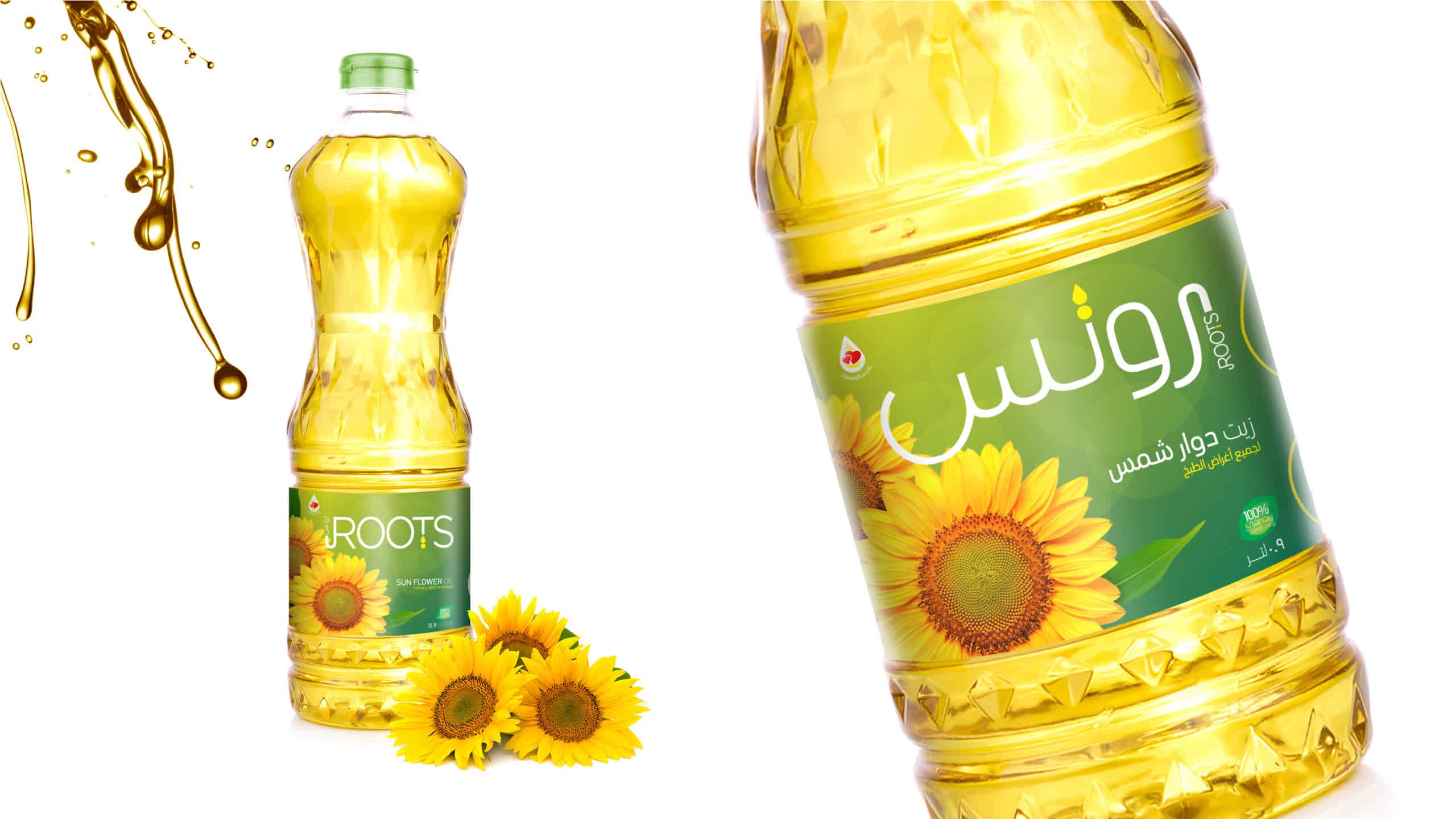
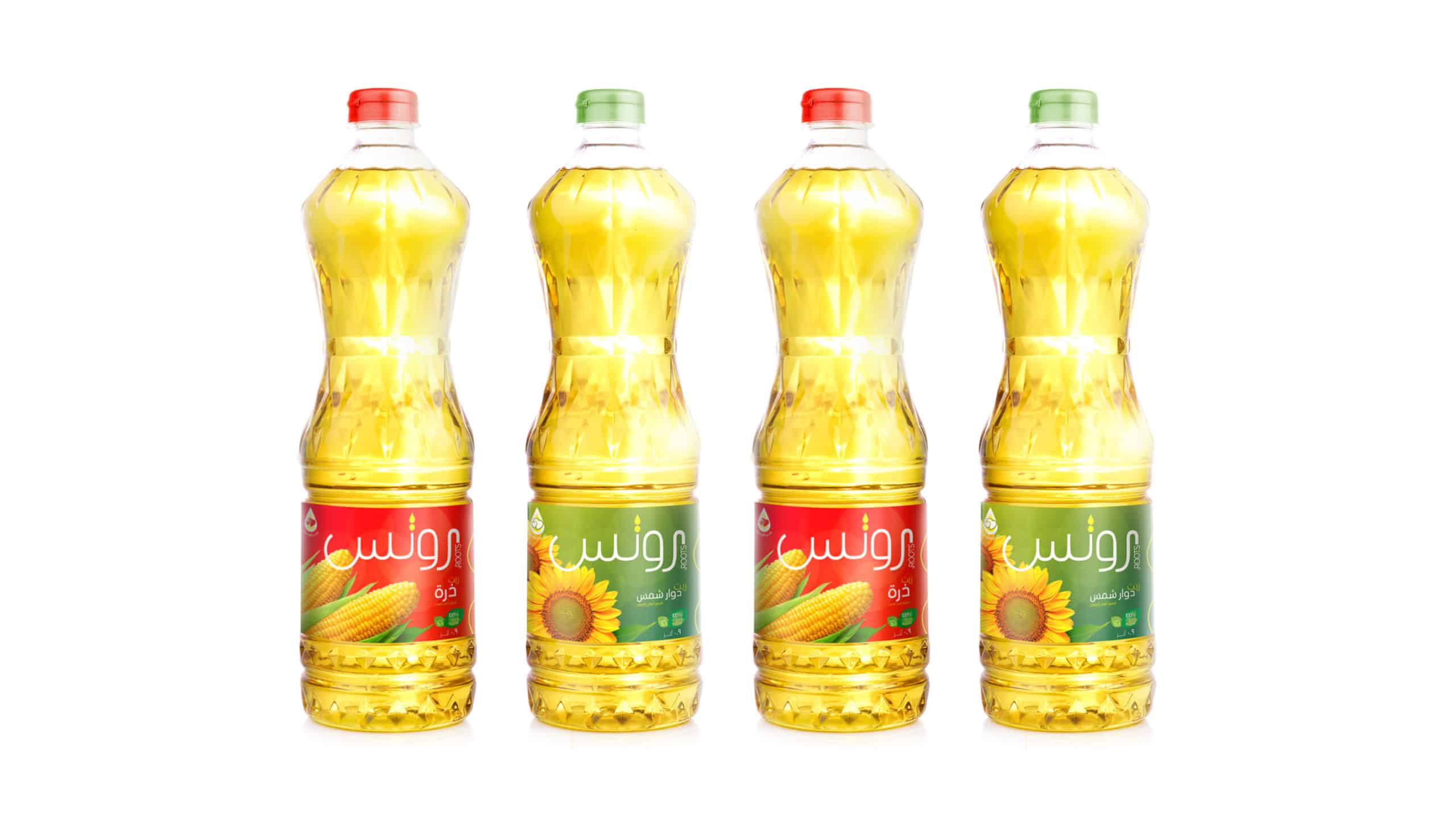
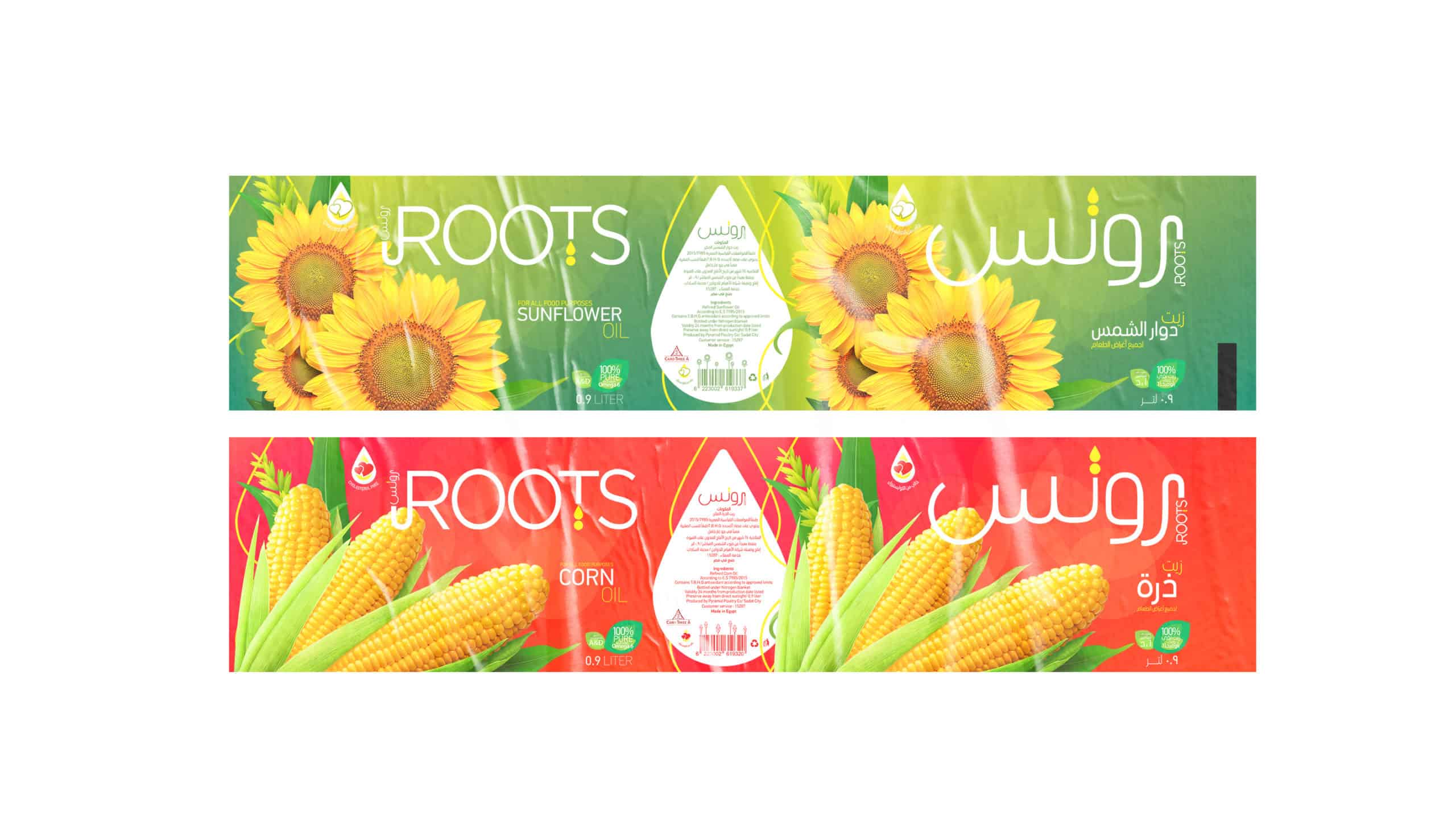
Roots aimed to refresh its packaging to reflect a modern image and stand out on store shelves. Müller’s branding team was tasked with redesigning the packaging for Roots Pure Corn Oil and Roots Pure Sunflower Oil to enhance visual appeal, communicate quality, and incorporate eco-friendly elements.

  1. Design Concept: Developed a modern design with clean lines, vibrant colors, and transparent strips to showcase the product. High-quality images of corn and sunflower fields were used for a natural look.
  2. Brand Messaging: Highlighted key attributes like “100% Pure Corn Oil” and “100% Pure Sunflower Oil,” with clear nutritional benefits and uses.
  3. Logo Update: Subtly updated the Roots logo for consistency.
  4. Eco-Friendly Packaging: Used recyclable materials to reduce plastic usage, communicating this commitment on the packaging.
  5. Consumer Feedback: Conducted focus group testing to refine design.
  6. Launch Campaign: Rolled out in-store promotions, social media announcements, and influencer partnerships to introduce the new packaging.

Cairo 3A

2020-02-15

THE OBJECTIVES

Modernize the brand image. Improve shelf appeal. Clearly communicate product benefits. Use sustainable packaging solutions.

THE AUDIENCE

A, B+, B Young Adults housewives, Mothers Age 30-55 Years

THE SERVICES

Branding concept Packaging

Branding, Packaging Design

MIGRATION

raise

photo
photo
photo
photo
photo
photo

RESULTS

Significant sales boost post-launch

Increased Sales

Positive consumer perception of a modern, trustworthy brand.

Enhanced Brand Image

Positive feedback on packaging clarity and aesthetic appeal

Consumer Engagement

Improved brand reputation for eco-friendly practices

Sustainability Recognition

Helped Roots stand out in the competitive market

Market Differentiation